BOBI HARTANTO
PORTFOLIO SHOWCASE


MOKA POS - Redesigning Moka POS Receipt
Company:
Moka POS
Timeline:
2017-2018
Role:
Sr. UI / UX Designer
Responsibilities:
Research, Product Design, Business analyst
Imagine Stretch Armstrong arms yanked left and right, legs pulled up and down, stretched to his limits but never breaking. This is what happened to Moka POS receipts.
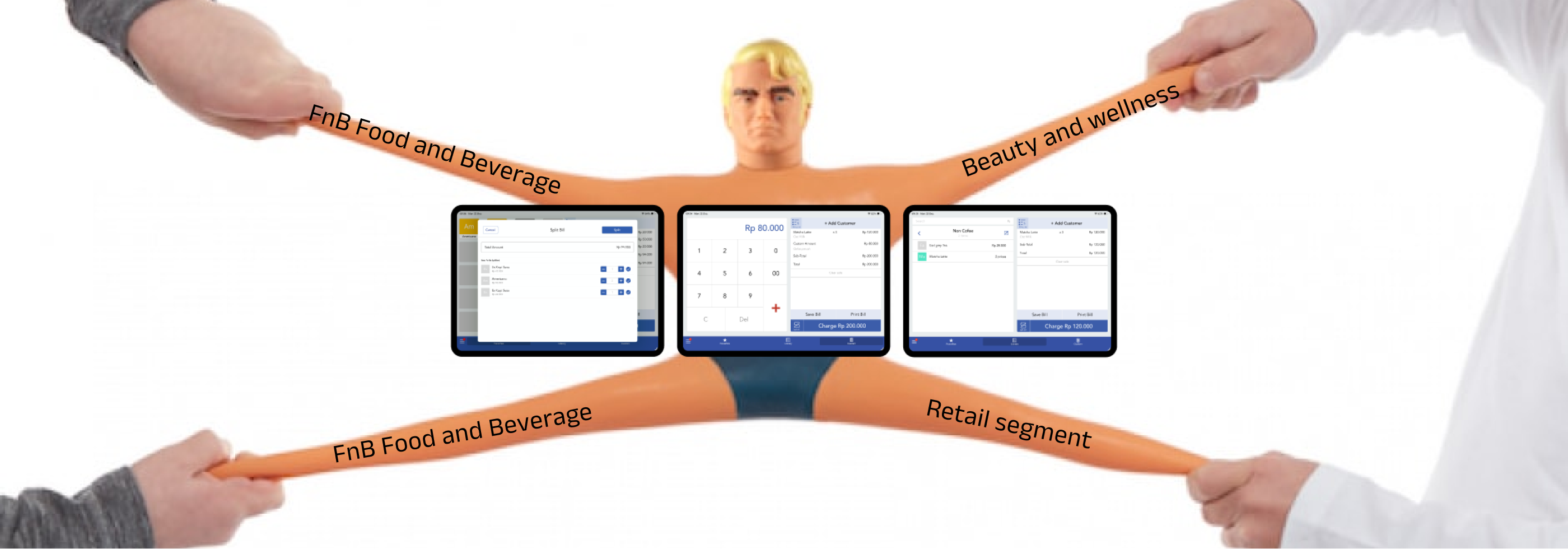
Moka serves coffee shops, clothing boutiques, salons, and everything in between across Indonesia. Each business has different needs, but they all share one constraint: a 32-character-wide thermal receipt for old 58 thermal printer. Food outlets need modifiers ("Extra shot, no sugar"). Retail stores need product variants ("Size M, Red"). Beauty and wellness need to put therapist or capster name. Everyone needs to fit Indonesian Rupiah amounts numbers that eat up precious space by default.
As Moka expanded into more industries, the receipt absorbed more data types without getting any wider. What started as simple proof of payment became an overloaded artifact, stretched thin across competing demands. This case study explores how we redesigned a single receipt format to serve everyone without snapping.
Problem Discovery
Receipts weren't just failing they were failing differently for each business type. Customer complaints revealed a pattern: the same fixed format was breaking under the weight of diverse business needs. A coffee shop receipt looked cramped and unreadable. A boutique receipt couldn't show product variants clearly. A salon receipt buried appointment details in a wall of text.
The core issue wasn't that receipts were bad—it's that one receipt format was trying to be everything to everyone.
Technical Constraints
The 32-Character Prison
Thermal printers used by most Indonesian merchants can only print 32 characters per line. This isn't a design choice it's a hardware limitation. Every word, every number, every space must fight for those 32 slots.
Unlike digital interfaces that can expand or reflow, a printed receipt is permanent and inflexible. Once printed, it cannot adapt. This made every character decision critical.
The Currency Problem
Indonesian Rupiah compounds the space issue. A simple coffee might cost Rp 25.000, consuming 9 characters just for the price. Add a product name, quantity, and you've already used over half the line.
Compare this to USD pricing where $3.50 takes only 5 characters. Indonesian merchants lose 4 extra characters per line item—space that could show crucial product details instead.
Three Actors, Three Different Worlds
Food & Beverage
What they need: Modifiers and customizationsWhy it matters: "Iced Latte" isn't enough customers need to see "Extra shot, oat milk, less ice" to verify their order and for kitchen staff to prepare it correctly.
Retail
What they need: Product variantsWhy it matters: "Cotton T-Shirt" is meaningless without "Size M, Navy Blue." Returns and exchanges depend on this specificity.
Beauty & Wellness
What they need: Service details and staff assignmentWhy it matters: "Hair Treatment" needs to show duration, therapist name, and appointment time for operational tracking and customer reference.
Each segment was pulling the receipt in a different direction, demanding space for their specific data while the 32-character limit remained unchanged.
Design Goals
1. Universal but Flexible Create one system that serves all segments without becoming bloated for any single one.
2. Information Hierarchy Not all data is equal. Essential transaction info must be readable at a glance; secondary details can take more space if needed.
3. Respect the Constraint Work within 32 characters, not against it. Turn the limitation into a design principle.
4. Preserve Functionality Receipts aren't just for customers—staff use them for order fulfillment, and merchants use them for record-keeping. The redesign must serve all actors.
The Execution
Key Learnings
Constraints breed creativity, not compromise. The 32-character limit felt restrictive at first, but it forced us to question every word, every line break, every piece of data. This discipline led to a clearer, more intentional design than an unlimited canvas ever would.
One size fits all is a myth—but adaptive systems work. Instead of forcing every business into the same rigid template, we built a system that could flex based on transaction type. FnB receipts emphasized modifiers, retail receipts highlighted variants, and service receipts surfaced appointment details—all using the same underlying structure.
Design for the weakest link. We optimized for the longest currency values, the most complex product names, and the tightest hardware constraints. When you design for the worst-case scenario, everything else becomes easier.
Stakeholder mapping matters more than you think. Receipts serve three distinct users: customers (proof of purchase), staff (order fulfillment), and merchants (record-keeping). Each has different priorities. Early prototypes failed because we optimized for only one group. The final solution succeeded because we mapped all three needs and found where they overlapped.
Print is unforgiving. Digital interfaces let you iterate live. A printed receipt is permanent. This forced us to be more rigorous in testing edge cases—extra-long product names, maximum modifier counts, multi-currency transactions. What ships to production must work the first time, every time.